Mobile design first, then desktop – The rules have changed

Designers still get it wrong when designing for mobile. They design from desktop to mobile with a strong focus on what they would proudly boast is responsive design. Responsive maybe but design, no! In this instance design is often further from the truth with squashing and squishing of each element one on top of another into a narrow tube with minimal thought about the appearance and structure of the visible content. I know this because I have argued with web developers on multiple projects up until recently about this however it seems for many the (wrong) status quo remains.
Taking advice from most developers about SEO or design is like taking advice about gourmet cooking from an auto mechanic in most instances and can be quite frustrating. 10 – 15 years ago when the web was predominantly accessed by desktop computers and laptops, the focus was on ensuring that a suitable experience could be had in a 1024 x 768 resolution environment and it seems that this thinking remains first and foremost. Then as an afterthought it seems appropriate to stack things vertically and call it responsive to address the needs of mobile.
Well, mobile is here now, and it will be even more prevalent in the future. If you don’t believe me yet, take a look at some stats:
- There are over 1.2 billion mobile web users worldwide
- In the U.S., 25 per cent of mobile web users are mobile-only (they rarely use a desktop to access the web)
- Mobile apps have been downloaded 10.9 billion times
- Mobile device sales are increasing across the board with over 85 per cent of new handsets able to access the mobile web
Source: Codemyview
Asos suggests 60 per cent of its global traffic is mobile so it really is time to rethink design from a mobile upwards perspective. Mobiforge reported in November that the most popular screen size driving the largest amount of website hits is 4.7 inch (iPhone 6/S – surprise surprise).
Unfortunately, the design of most e-commerce websites are undertaken by web developers that have strong technical designers on staff but don’t understand usability and design synergistically. A developer is akin to a builder and needs to follow the architect’s instructions not the other way around as I am describing. Similarly, creative agencies focus on design elements and their opinion of what good usability is and often it starts with the desktop browser however I am seeing the light and some agencies are starting to understand design from a mobile upwards perspective, but this is still rather the exception than the rule.
Move to July 2015 and the creation of Internet Retailing’s partnership with Octomedia, the parent of the refreshed and relaunched Internet Retailing Website, I had the pleasure of discussing and scoping out the design concepts of the new website with Oliver Ranck, Octomedia’s efficacious operations and digital wizard, it was a delight to hear that he agreed we should design the site for mobile and then work backwards toward desktop browser.
A brief was given to the design team which came back with a design stacked in favour of desktop to mobile. We changed this logic by instructing the design team that Article pages get most of the reads on mobile and tablet whereas home page gets a minority of views in comparison.
The review of the brief was very clear how we wanted the mobile site to flow (yes this site you are looking at now), and this is what it looked like:
- Menu (which is floating but shrinks 50 per cent on scroll down)
- Top Stories i.e. trending one thin line
- Advert (leader board)
- Feature Story
- Top stories
- Advert (island)
- Stories by category (Image + Caption, one line with category header) – five stories – followed by island advert, up to 3x repeated before footer.
- Footer – categories, contact, privacy etc…
- Side banners will not appear on mobile
We considered the typical reader of our website, they could be having lunch, riding a train or sitting at their desk at work. They would receive an email with our latest news and click through to the website. With limited time they would click on the featured article or an article of interest then start reading. At the end of the article we wanted an auto loader to load the next story so we could deliver the 3 – 5 new articles one after the other without the reader having to fumble back through the menu to get to the home page regardless whether they were on mobile, tablet or desktop.
After much debate internally about which great sites we could use for inspiration, vice.com, Buzzfeed, Time Magazine, Breaking news etc. Tess Bennett (our delightful editor) suggested we look at recode.net as the site worked well on mobile and deconstructed back to a full browser well. We all loved the flow and agreed on this combined with elements we liked on our shortlists and agreed recode.net was a great reference point to tweak the look and feel of the mobile website having a solid idea how it would deconstruct on a tablet then further deconstruct onto the desktop website. We also wanted to have the flexibility to exclude less relevant content on mobile that may appear on the desktop site if required (such as side banners or boxes of content of our choosing).
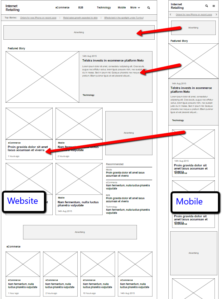
Our mobile to desktop approach (Click to enlarge)
Three weeks later we had a coded and working model, all the data from the existing Internet Retailing site had been transferred over and we were ready to launch.
In summary, the success of the website redesign was down to a fantastic team across the board. We internally knew what we wanted, our combined experience in web development, publishing and e-commerce were a no brainer. The designers quickly understood our needs and adapted to our requirements from mobile upwards, and an agile development team that understood the mobile upwards philosophy meant a quick, well project managed outcome with a fantastic site that can be easily modified to meet our changing needs as we grow massively in the next twelve months.
Mark Freidin is the founder of Internetretailing.com.au
Sources:
Codemyview
Mobiforge
Comment Manually
You must be logged in to post a comment.
Comments
Alex
Mobile first or desktop first depends on the business.
It makes sense in your case Mark, but one of the website I manage has only 3% of mobile traffic, so mobile first approach in this case isn’t right.