Advertorial: How good is David Jones’ online checkout?

According to research from the Baymard Institute, the global average cart abandonment currently sits at 68.6 per cent.
In other words, after having gone through the trouble of finding a product and adding it to their cart, a massive two out of three users still choose to abandon the purchase.
This has website owners across the globe scratching their heads, reconsidering the sort of investment dedicated to getting customers on the site in the first place.
Retailers acquire customers via social media, pay per click, SEO campaigns, not to mention build their website with photography, beautifully crafted home-pages and copy, perfect category taxonomies, investment in search systems, loyalty systems and staff, only to see 68 per cent of their effort wasted on sheer customer aloofness. Or is it?
The research shows 58.6 per cent of online shoppers abandoned carts because they were just browsing. They are doing what consumers do, window shopping, price comparisons, wish lists etc.
This segment is untouchable, that is, no amount of UX changes will make a difference in bettering checkout conversion.
(Changes can be made to cater for browsers, especially in search or homepage category navigation, but that’s the theme of a separate article.)
But for the remaining 10 per cent that abandoned cart, e-commerce professionals can make changes to influence conversion.
The Baymard Institute study* concludes that improvement to checkout design “can gain a 35.26 per cent increase in conversion rate – just by making design changes to their checkout process”.
So let’s see how one of Australia’s most iconic fashion retailers, David Jones, fares with their checkout design.
1. Shopping bag page
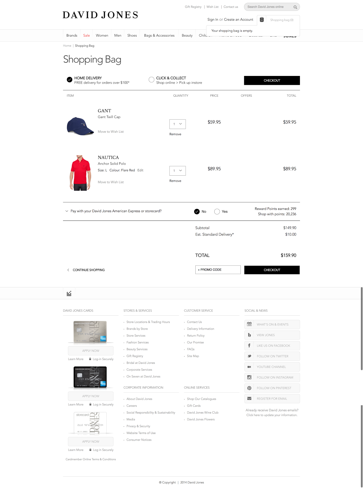
The initial page in the cart is well laid out with all the information on one page, which helps users make their purchase decision.
This negates any surprises about cost later in the process. Remember that extra costs are the biggest reason someone may abandon cart.
David Jones also features their American Express cards, which is part of their loyalty scheme, on the shopping cart page.
Even though this information is well below the fold, it tempts customers into going through another process rather than just focusing on paying.
The product pictures on this page are also much smaller, which does not reinforce the initial excitement that I felt for the products and the purchase.
2. Checkout page
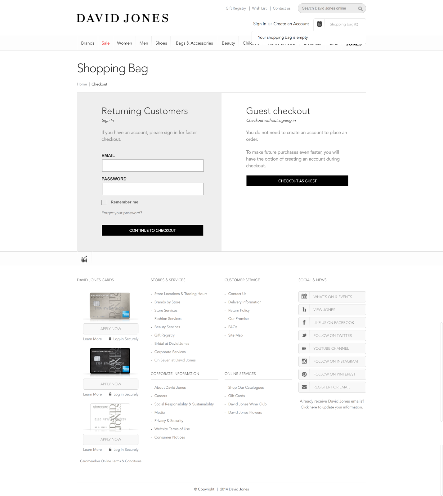
One of the most common UX problems is that guest checkout options are difficult to find, even though nearly all sites offer one. Customers end up believing the brand is making them create an account.
David Jones have this covered, as they dedicate an extra step in the process to make it clear. The shaded box for returning customers also makes it easy to get through this process which is normally fraught with danger .
3. Shipping details page
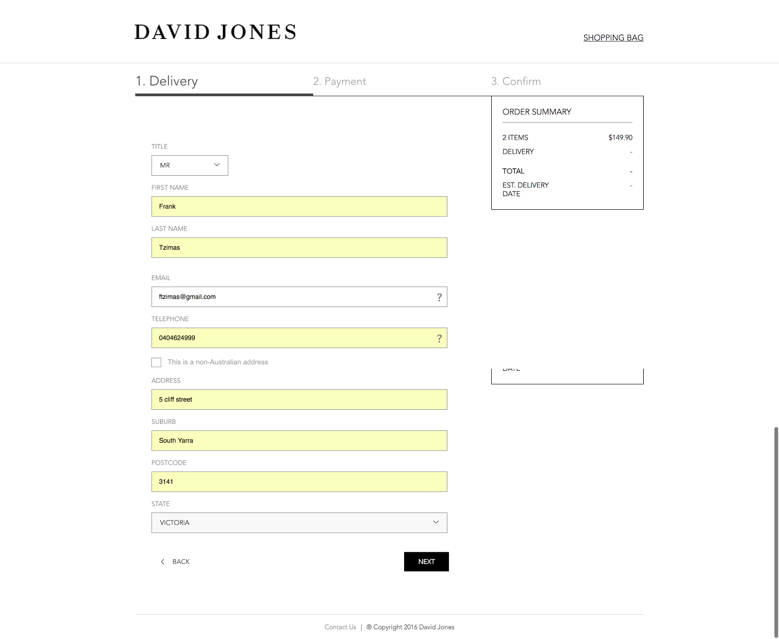
Forms for both shipping and payment details are auto filled, which saves the customer a lot of time.
David Jones defaults the billing address to the typed shipping address, hiding the fields entirely, and auto-detects the city and state values based on the entered post code.
But nowhere during the checkout process did David Jones even attempt to address people’s privacy fears.
According to Baymard Institute, this is an issue at over 54 per cent of the websites it researched.
The lesson here is don’t think attitudes about privacy are universal or implied. Increasingly, more people want guarantees that their personal information will not be sold to third parties.
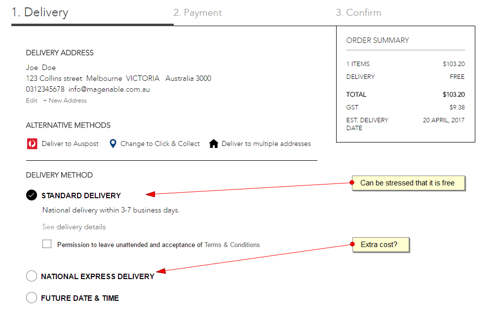
4. Delivery page
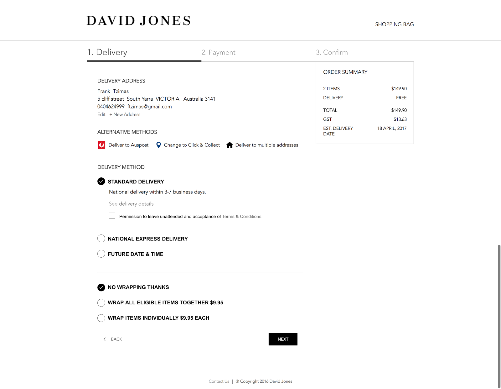
David Jones has some solid practices on this page. The option for gift wrapping and delivering at a future date and time, as well as confirming delivery turnaround dates and costs, are all customer-friendly.
The company can probably do a better job clarifying the difference between delivery methods:
- Emphasise that standard delivery is free next to the delivery method, not just in the mini-cart.
- Show the cost and preferably speed of Express Delivery. At the moment it isn’t clear.
5. Billing page
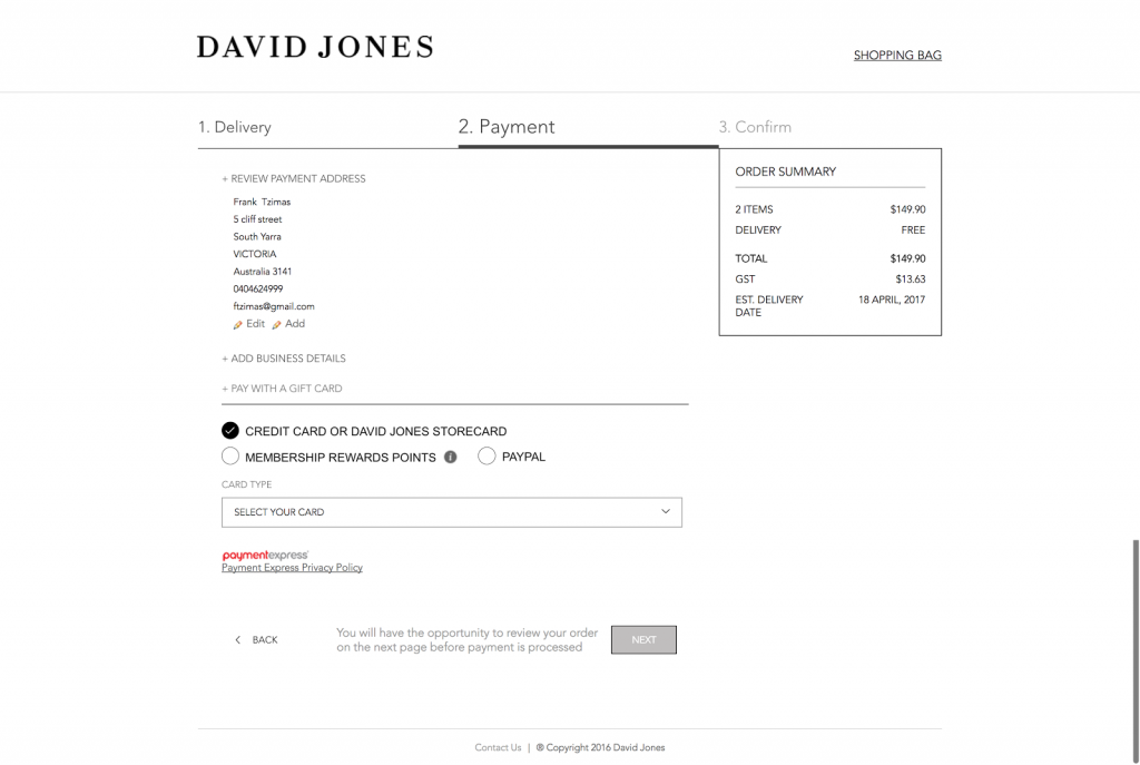
Not having enough payment methods, can be the sole reason for cart abandonments, so it is important to cover many different payment options on the billing page.
David Jones has a drop down box for different credit cards as well as Paypal, membership points, and David Jones cards. This means customers have an option even if they don’t have a credit card.
Surprisingly, David Jones has no ‘buy now, pay later’ option on the website.
I believe this is a bit of a no-brainer. Thousands of retailers provide this option, so customers who are not provided it will look elsewhere.
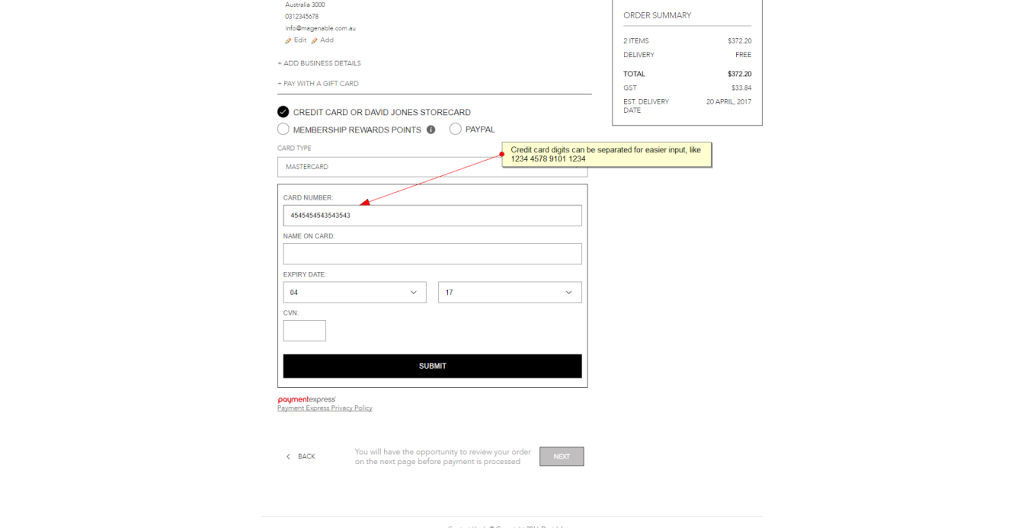
A small improvement in the field where customers enter their credit card number may help reduce the number of errors.
At the moment there is just one long field. By adding a separation every four digits, the website will reflect the way the number is displayed on actual cards and make it easier for customers to type and check.
6. Confirmation page
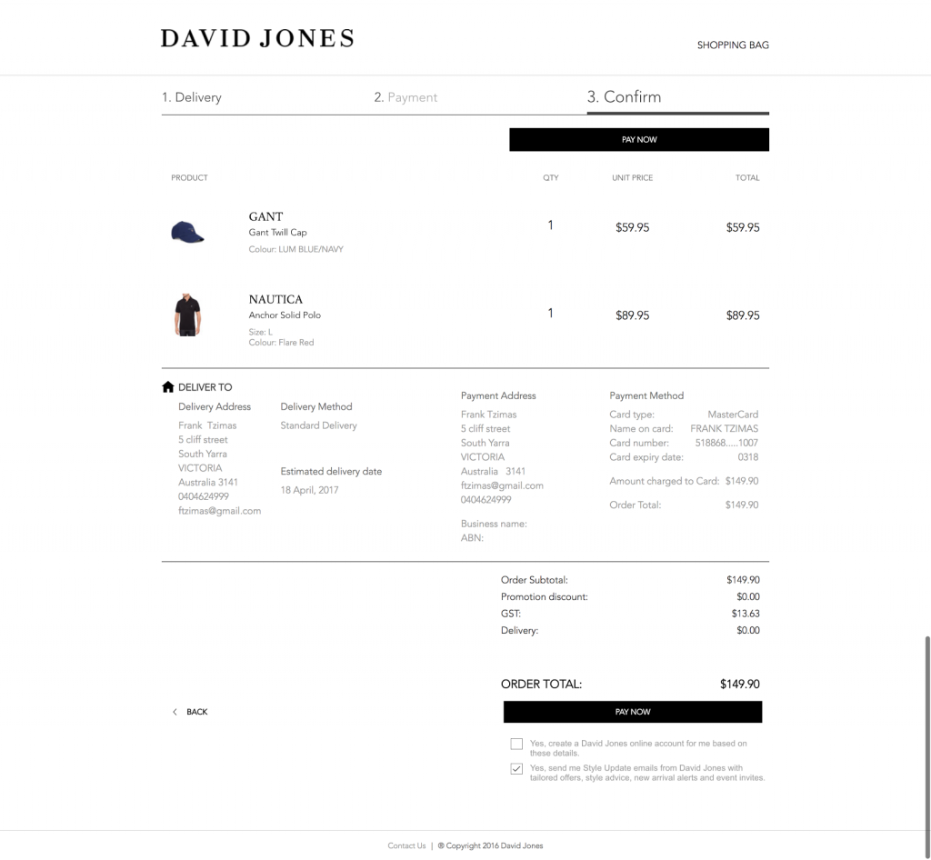
Once again David Jones has a perfectly presented confirmation page, allowing for no surprises in the details of the transaction. And it’s all done on a stylish-looking page.
Conclusion
As we have seen in this article, David Jones customers go through a six-step process to check out, from the shopping cart to the order review.
According to the Baymard Institute, the average checkout flow for a new user is 5.42 steps long, so David Jones is right on the money for a well thought-out check out.
Anything less would compromise the UX; that is, important parts of the process may be hidden under drop down boxes and in fine print.
Overall I would give David Jones a score of 8 out of 10. They have a brisk and enjoyable cart process that focus on the details when they matter.
The lesson here for SMEs and smaller businesses is that most cart improvements don’t require major financial resources or advanced technical skillsets.
Small changes to page layout, the addition of simple form features, and being really clear with the details and the process can all make a difference.
*For its 2016 report, E-Commerce Checkout Usability, Baymard Institute tested 6,052 participants over a 7 year period and produced 134 guidelines on shopping carts. The result is perhaps the most comprehensive study ever done on the subject.
Frank Tzimas has over 30 years’ experience in creative advertising and digital marketing and is commercial director at Magenable, a boutique eCommerce consultancy that specialises in strategy as well as development. Services include business audits, cart and conversion optimisation, maintenance and web optimisation projects.
Comment Manually
You must be logged in to post a comment.
No comments